Covid19 data guide: Is R for naught?
Introduction
Tesla re-opens its California plant and the US starts to lift measures across the country. The Netherlands slowly eases out of its ‘intelligent lockdown’. But does the data agree that this is the right time? In this blog, I will try to show common statistics and explain how to look at them. I will refer to "the coronavirus" as COVID19.A small disclaimer; I'm not actually a health professional, virologist, or epidemics expert. I'm a former junior physicist and have been a data engineer for years. I will supply my sources at the end. Please follow the advice of your local disease control agencies and government.
I have composed a small report in Google Datastudio with data from Google Public Datasets –specifically the dataset JHU Coronavirus COVID-19 Global Cases, by country - Johns Hopkins University – to accompany the images in this blog.
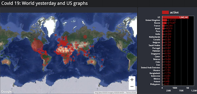 |
| Global active cases. Bubbles are sized in proportion to the number of current active cases. The sidebar displays actual data for countries with the highest number of active cases. Data were taken from the public dataset mentioned in the introduction. |
Cumulative cases and Active cases
First, let's look at confirmed cases and active confirmed cases. Active cases are those confirmed cases that haven't recovered or, sadly, have passed away.It is more difficult to compare data between countries, because different testing strategies and testing measures are in place. How do you compare a large country facing supply limitations that impact testing strategy with a small country that can test everyone? The larger country might be underreporting because of supply, while the smaller country is reporting with better accuracy. Let's take a look at the US and the UK.
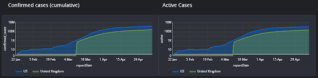 |
| Confirmed and active cases for the US and the UK. Logarithmic scale. |
First, the sudden jump in UK cases is not a reflection of reality, but rather a limitation in the data I'm using to compose these charts. The dataset only includes the UK's data from the 11th of March, a month after the first cases in the UK.
After the virus is first detected, we expect the number of infections to grow exponentially. This persists until preventive measures are taken, typically including forms of social distancing and lockdown. Lockdown measures help to contain the virus within a population, with fewer viable targets, so that it slowly stops spreading. At this point, the infection rate will flatten, as shown logarithmically.
It is not unrealistic to suppose that as lockdowns are lifted there will be new outbreaks of the virus. This will probably show itself most clearly in active cases, which would suddenly surge to new heights.
Flattening the Curve
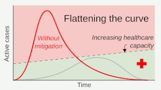 |
| Flattening the curve, GIF from Wikipedia |
Healthcare systems have limited capacity. This means that, as the virus spreads, there is potential for healthcare systems to become overloaded. This would lead to a higher number of mortalities and complications because people would not be receiving proper care. It also potentially results in a surge in new cases because there is no capacity for testing or containment.
As a result, images like the one in this section have been broadly shared. They are simply showing how a flattened curve will not overload the healthcare system.
Death and Mortality
Next, we look at cumulative deaths and the daily number of deceased persons. These numbers are very harsh; at the same time, they are also more difficult to interpret. As is written in this BBC article, there are two kinds of fatality rates. These include the proportion of people who die and have tested positive for the disease, or the "case fatality rate". Second, the proportion of people who die after being infected – an estimated number –, or the "infection fatality rate". That means that the mortality rate is also depending on the testing strategies. For instance, a country that only tests the elderly (a known high risk group) would report a significantly larger case fatality rate than one that tests everyone. For this reason, I merely look at overall deaths and the daily statistics.
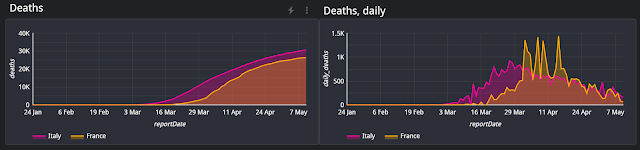 |
| Cumulative and daily deaths |
There is another way to look at reported deaths. Many agencies monitor the seasonal projections of mortality versus the actual mortality rates for hidden problems. This is known as excess mortality:
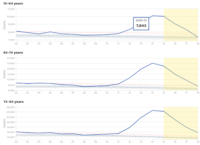 |
Charts from EuroMOMO, a European mortality monitoring activity |
Excess mortality is up in the population shown for every age group above 15 years old. In week 19, excess mortality in monitored countries is at 173,000 additional deaths. For comparison, excess mortality in 2019 was 56,000.
When is it safe?
When can measures be lifted? None of these graphs make it clear. Instead, we can review a very basic epidemic mode: A constant population in which anyone can potentially infect everyone.In our model, the "reproduction number" details the number of individuals who might be infected by an infected individual. The `Basic` Reproduction Number, (sometimes R0 or R naught) denotes this number in cases where no measures are taken to prevent infection. To make a comparison, Influenza has a basic reproduction number of 1.3. The estimated basic reproduction number for Covid19 was about 2.65, but was more recently updated to 4.5, while the mortality rate seems to be higher than for influenza. The basic reproduction number can be used to estimate the percentage that needs to be immunized (it is 1-1/R0). For influenza, that should be around 25%, while Covid19 would require something like 78%.
In my small report, I've included an "Estimated Reproduction Number", estimated using the ratio of current infections (day over day) divided by those of one week ago. We would expect the estimation to fluctuate until we have more data for that country's infected population, then drop from a high value to a lower one that is ideally below unity.
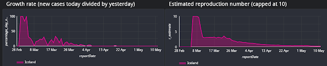 |
| Iceland, growth rates, and estimated reproduction number. |
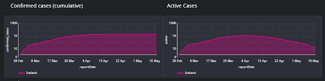 |
| Iceland confirmed cumulative cases and active cases. |
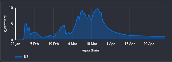 |
| Estimated reproduction number, US |
Granularity matters
Despite these numbers, it can be that a government doesn't ease up on measures, even after the estimated reproduction number drops below 1. While the situation might be under control when looking at the entire population, it might still be growing (or upcoming) in a specific region. For example, in the US, the hotspot is New York City. As the virus has infected a large proportion of the population, even a low reproduction number can mean an absolute number of hundreds of new active cases. If the hotspot is new, it might show an absolute number of a few hundred active cases but have a local reproduction number that is far above unity.
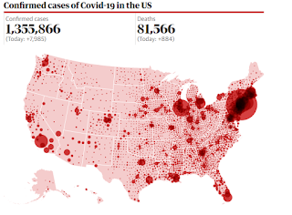 |
| The granularity of covid19 cases in the US. [Source] |
Not influenza, at all
 |
| President Trump on Twitter, 9th of March 2020 |
Some people especially at the start of the pandemic – compared covid19 to influenza. After all, they're both respiratory diseases.
In the US, more than twice the normal number of deaths (approximately 36 thousand) have already been registered and the outbreak has not reached its end.
Covid19 is more infectious and has a higher mortality rate than influenza. It causes death not only amongst the elderly but for anyone over the age of 15. And that's just a number – keep in mind, we are talking about people. It doesn't matter what someone's age is, or whether they have a pre-existing condition. Almost 10% of the population is 70 years or older, and millions are immunocompromised or have other conditions.
Please, don't go around literally saying that people are expendable, that they don't have the same right to live as a healthy or young person. That is vile, unnecessary, and horrible.
We are amidst a tragedy, one in which everyone loses something. Some people lose their lives, some people permanently lose their relatives, their life partners, or their friends. Everyone temporarily loses some freedom and activities that remind us that we are human.
We are all humans restricted in our options and at risk of losing people we care for. We are in this together.
Sources
- https://thecorrespondent.com/352/deciphering-the-pandemic-a-guide-to-understanding-the-coronavirus-numbers/46555890304-c23a82af
- https://en.wikipedia.org/wiki/Basic_reproduction_number
- https://web.stanford.edu/~jhj1/teachingdocs/Jones-on-R0.pdf
- https://plus.maths.org/content/maths-minute-r0-and-herd-immunity
- https://cloud.google.com/blog/products/data-analytics/free-public-datasets-for-covid19
- https://www.cebm.net/covid-19/when-will-it-be-over-an-introduction-to-viral-reproduction-numbers-r0-and-re/
- https://www.worldometers.info/coronavirus/coronavirus-incubation-period/
- Link to my report using BQ Public dataset covid19_jhu_csse
- High Contagiousness and Rapid Spread of Severe Acute Respiratory Syndrome Coronavirus 2, suggesting an R0 of 5.7, implying coverage required for herd immunity will be 82%
- R0 as a complex model parameter